There is a lot of buzz out there about Office 2013. But in my mind, it’s the simple things that make life wonderful and the Outlook team at Microsoft has implemented many of those simple little things to make the email collaboration experience just that little bit brighter. Here are a couple of the things I really liked right out of the gate.
One of my favorite overhauls is the Navigation bar at the bottom. As you can see it has a new layout with a new color scheme. Furthermore, you now have the option of words rather than icons. If you prefer the old navigation bar with the old icons they are still available as an option. Just click those three dots, from the menu pick Navigation Options and it will bring up a dialog box where you can check something called Compact Navigation. However, I have worked with Outlook since Outlook 97, so the words were a refreshing change, and since installing they have remained steadfast my only configuration. It’s hard to say if the words have made me navigate any faster but I tend to believe they have. The other change you may notice is that Contacts are no longer called Contacts. It seems a little more personable now, but Microsoft has renamed this tab to People, and I really like the change.
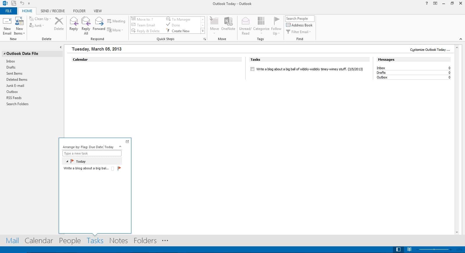
One of the other neat features, shown in the screenshot above, is the mouse-over function of the new navigation bar. As you can see in my example here, hovering the mouse over Tasks, shows you a preview of your task list. Similarly, hovering over Calendar would show you a preview of the calendar month and People let you search for people in your contact lists.
This mouseover feature is also prevalent in other parts of Outlook as well. The screenshot below shows the calendar view. You can see in this view I am hovering over one of my appointments and it gives me basic information about the appointment in a larger view. Definitely, more useful when you have lots of half-hour appointments that can’t display everything in their segment.
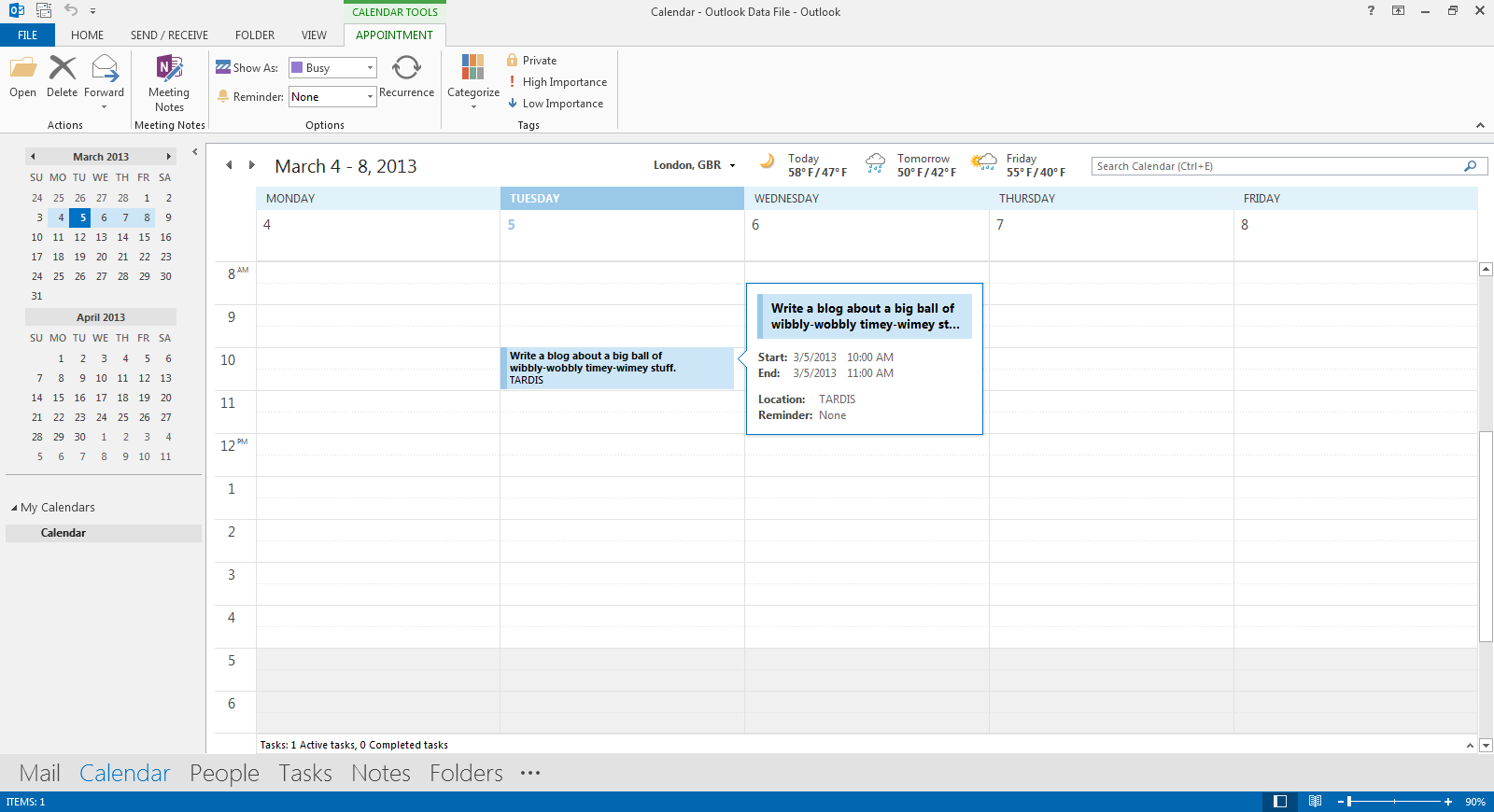
You may have also noticed the forecast widget at the top of the calendar. This can be quickly customized for your location. It comes standard with Outlook 2013 although I have yet to check how accurate this is. Like the calendar, if you hover over the forecast it will give you more information in an expanded view. You can also click on See More Online to bring up MSN Weather in your web browser.
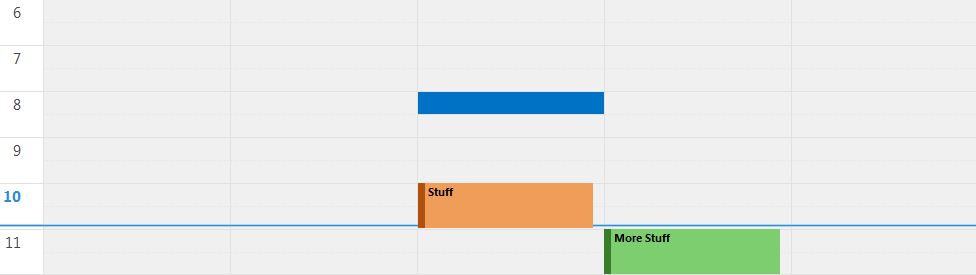
I also really like the coloring they have done to the calendar. As you can see we now have a nice crispy blue line scrolling down our calendar to show the current point in time in relation to our surrounding appointments. We also have the current hour on the left highlighted in bold blue. It makes maintaining your schedule very easy and clear to read.
I really like the new color scheme of Outlook. Everything seems so much more clean, crisp and uncluttered. You may have also noticed the zoom controls on the blue status bar on the bottom right. These work very well. This bar contains a lot of information and you can select just about anything it tells you. For example, in the screenshot below you can see I have highlighted the reminders. This is a clickable button that will display all my current meeting reminders in a separate dialog box.

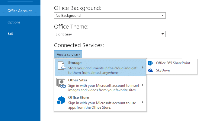
If you don’t like the default color scheme you can also change this. Outlook 2013 comes with three color schemes by default. These can be found under the File Menu >> Office Accounts >> Office Theme drop-down box. You can also add or change the background here as well from the Office Background drop-down box.
From this same area, you can also add Office365 SharePoint and SkyDrive storage accounts for alternative locations to save your office documents.
To summarize, these are just some of the first things that jumped right out at me on Outlook 2013. I hope you like this revision as much as I do. This is hands down the best version of Outlook ever and I highly recommend it.

How can I set Outlook 2013 so that I can mouse over the incoming mail and complete the subject as I could in 2010 and 2007?
Did M. Finley ever get an answer to: “How can I set Outlook 2013 so that I can mouse over the incoming mail and complete the subject as I could in 2010 and 2007?”
The mouse hover feature is extremely annoying. Do you know how to turn it off?
Muliple Mouseovers seem to have appear on the newest Outlook/Hotmail and they are soooo irritating.
And a new one has appeared today !
Just occasionally a “tooltip” can be helpful – but some of these Outlook/Hotmail pop-ups repeat what is already visible – so what’s the point.
Another pops-up when hovering over the sender – including a “Delete All” option – which combined with jerkiness from the (appalling) new Infinite Scroll Inbox risks unwanted message deletion.
Why can’t Microsoft ever OFFER new features rather than IMPOSE them?